Campfire
Project type
Consulting
Deliverables
Web App UI/UX
Campfire
Project type
Consulting
Deliverables
Web App UI/UX
Campfire
Project type
Consulting
Deliverables
Web App UI/UX
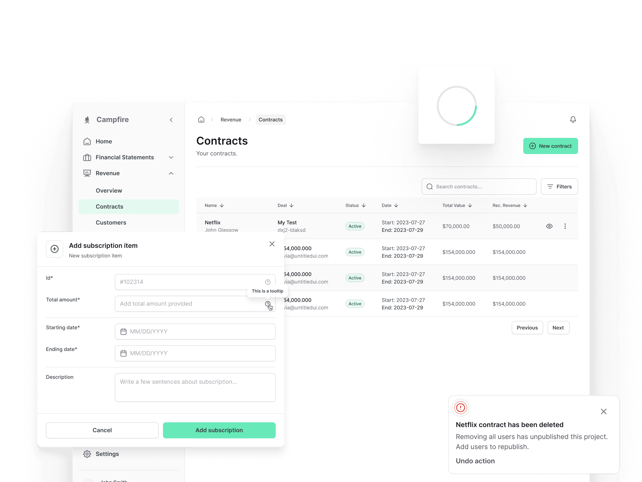

Building a modern approach to accounting software
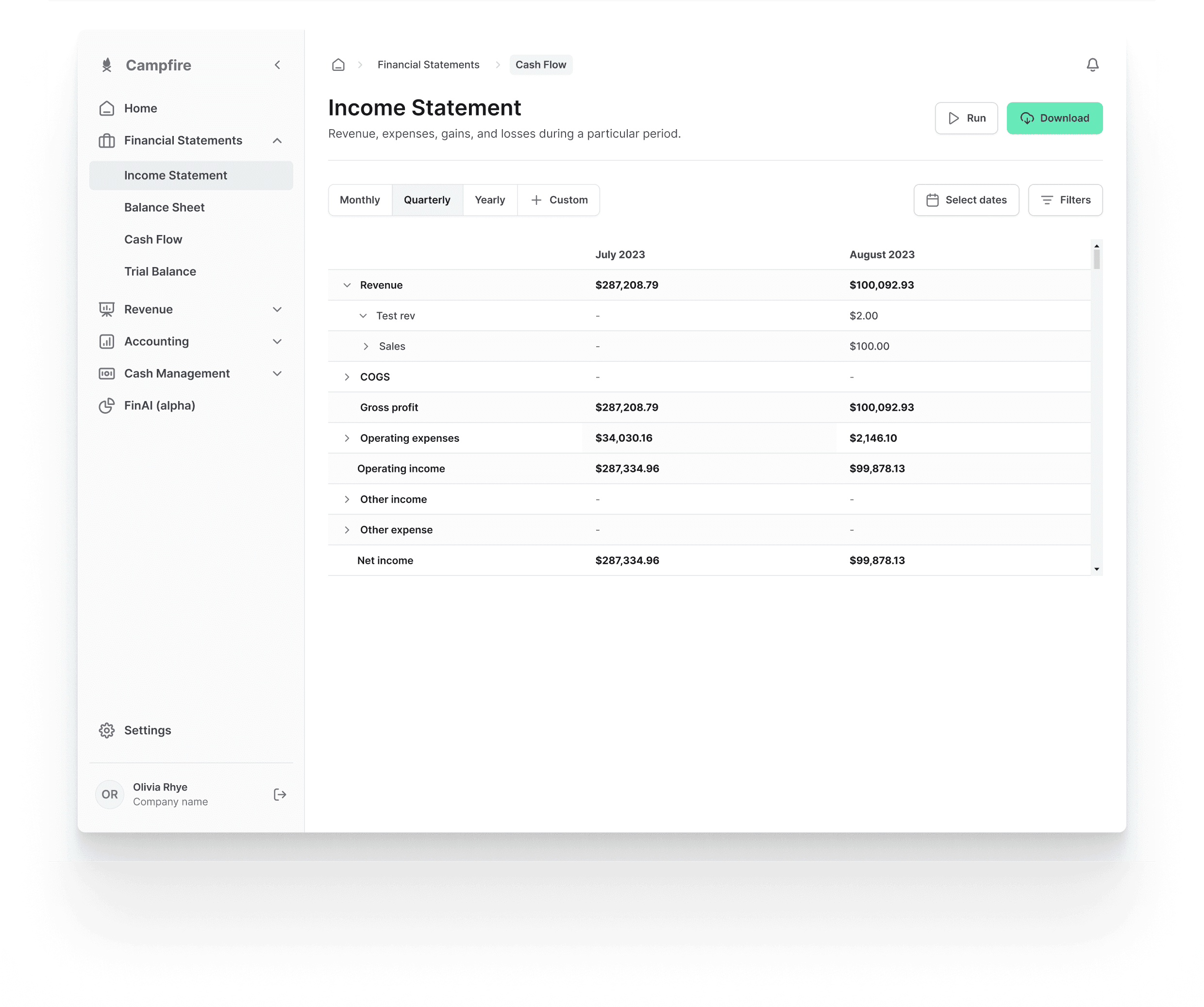
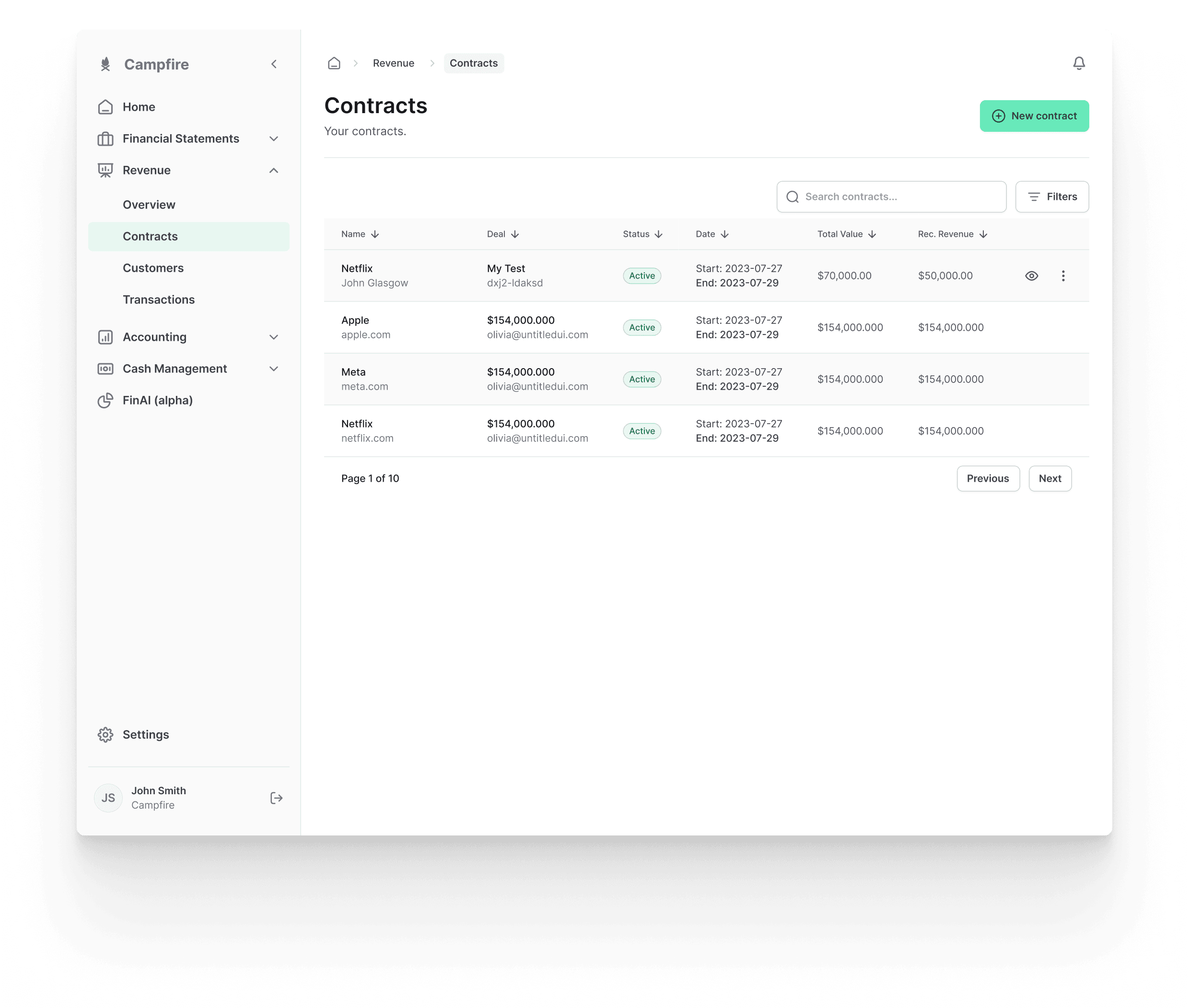
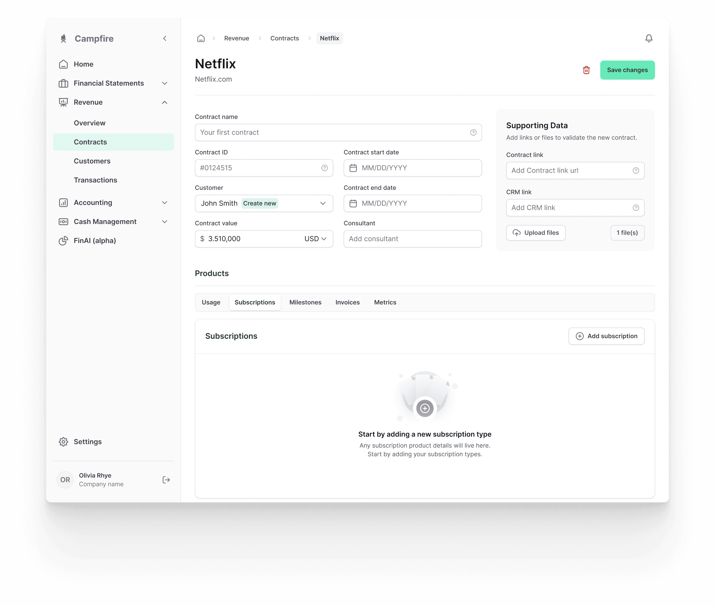
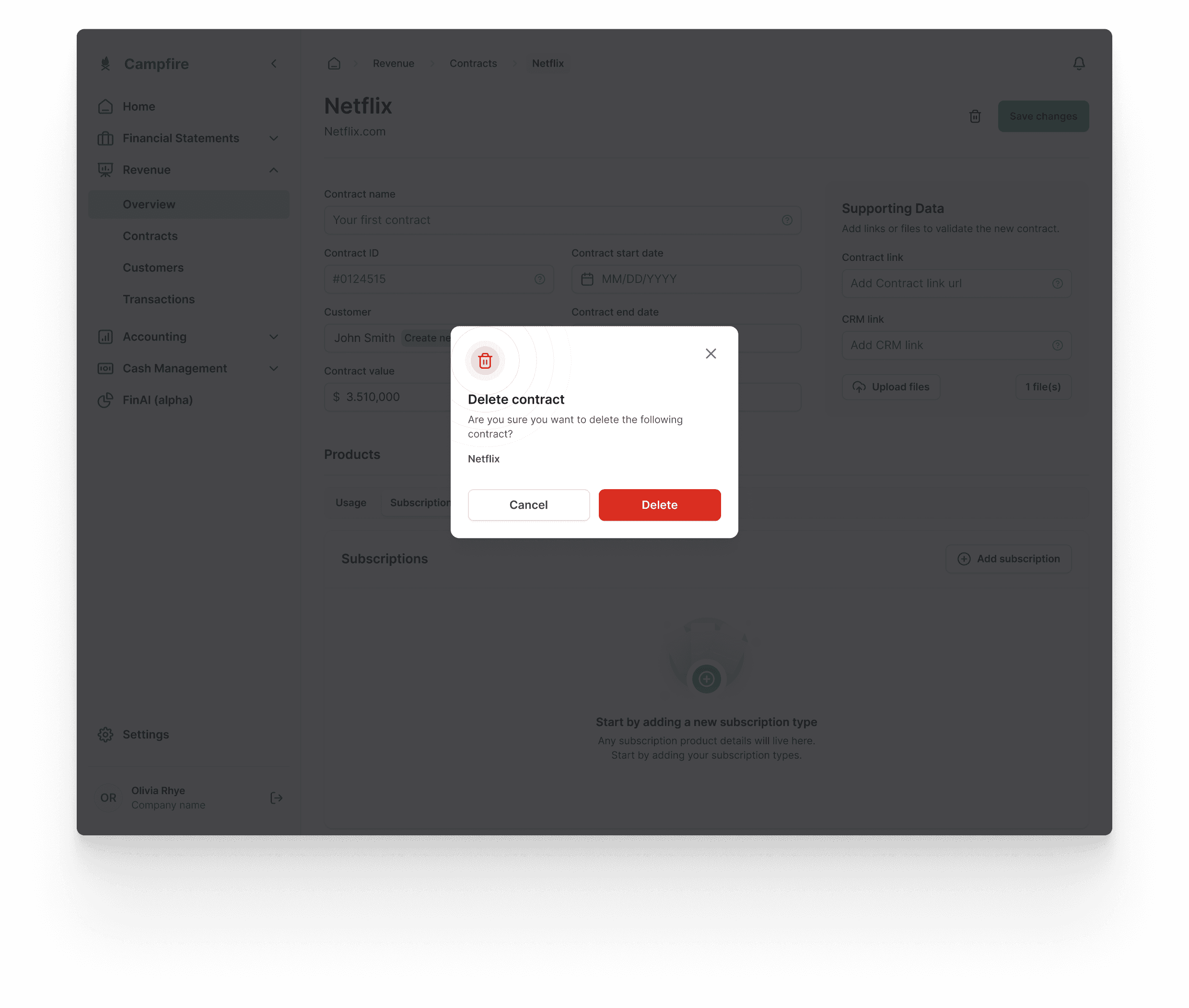
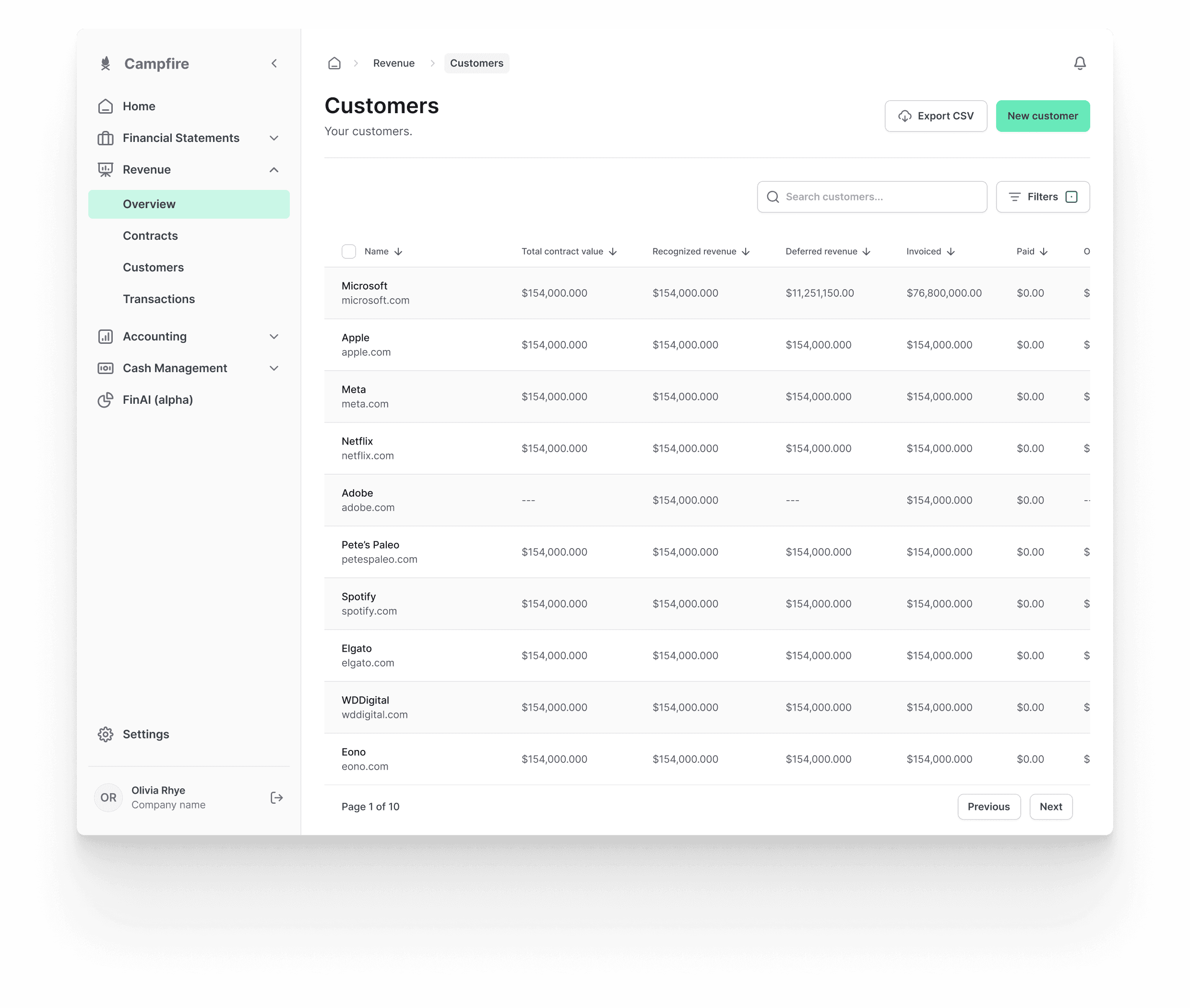
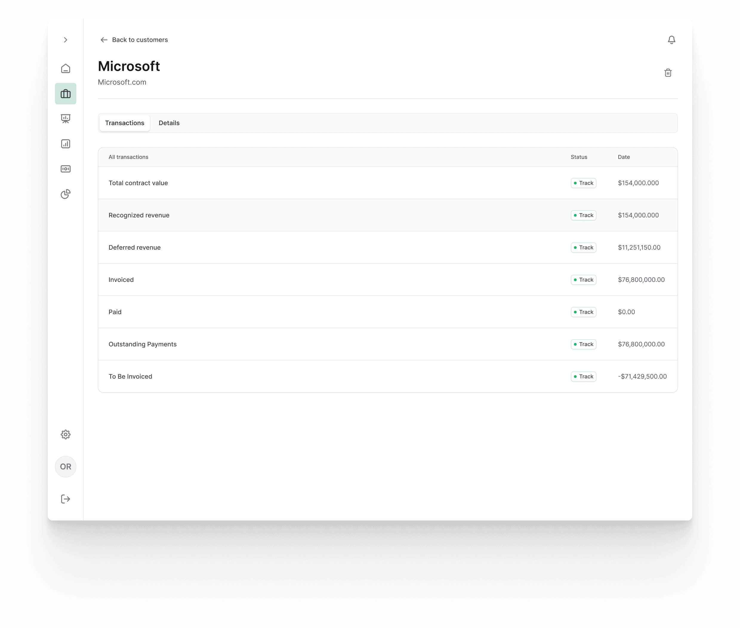
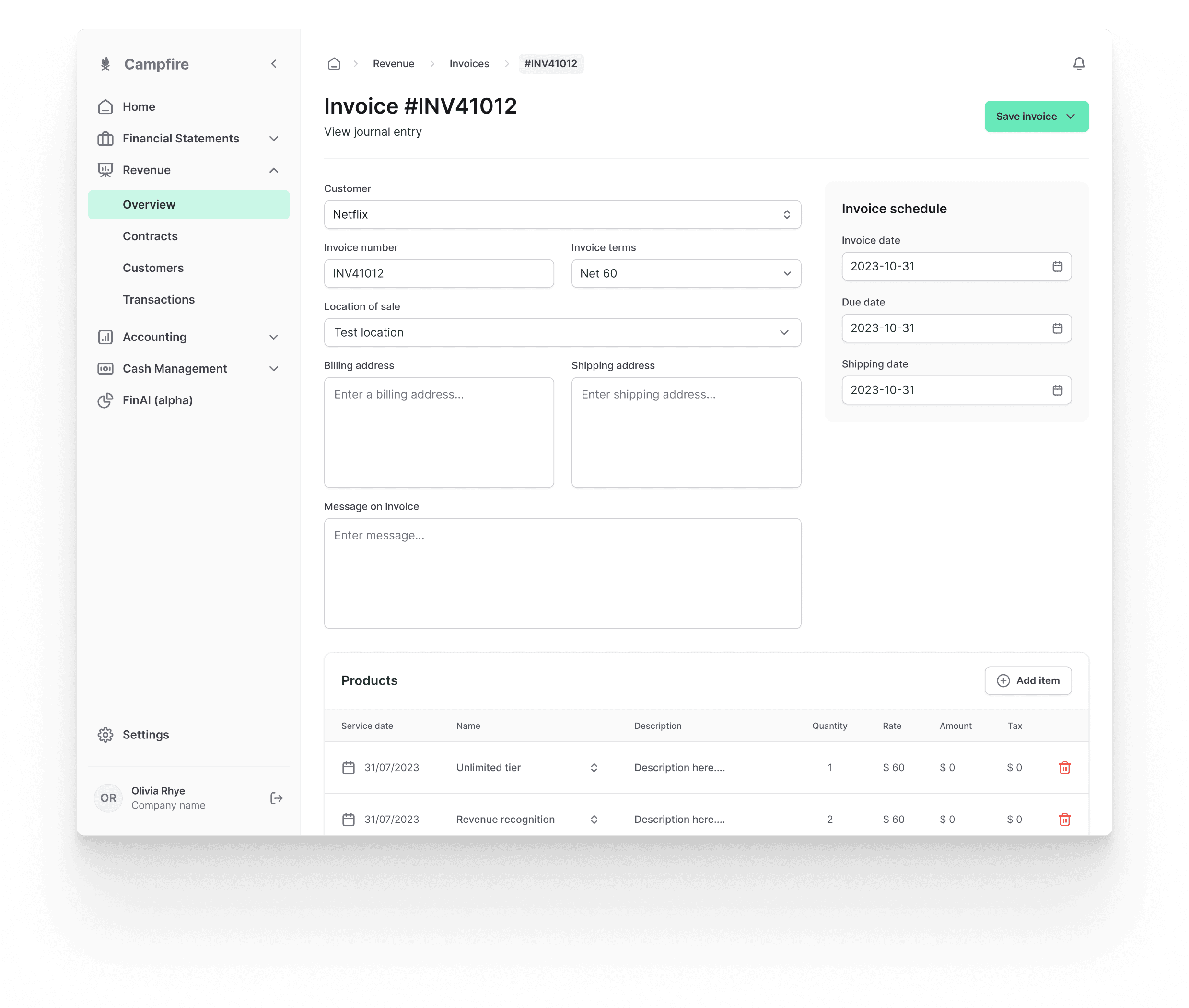
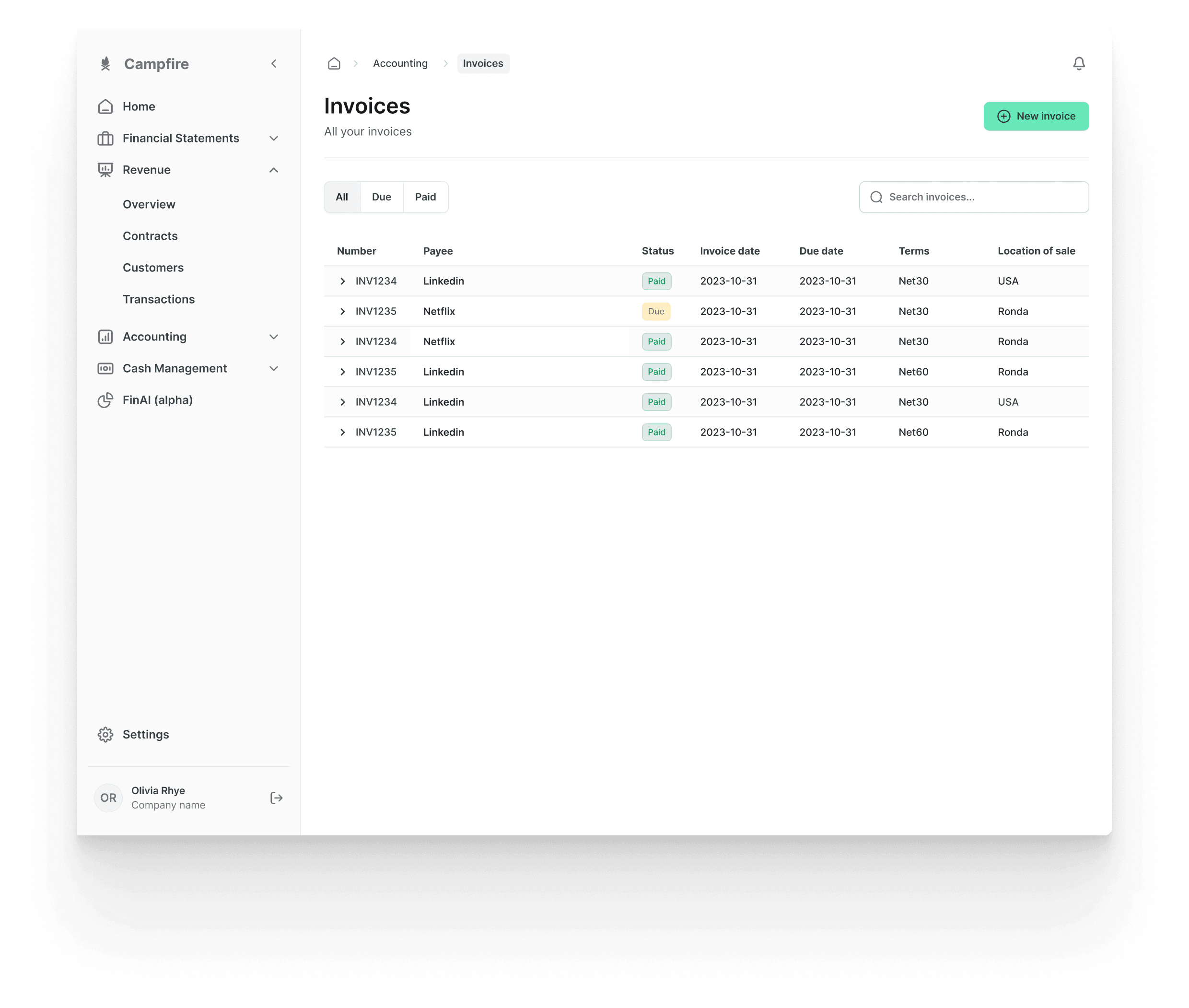
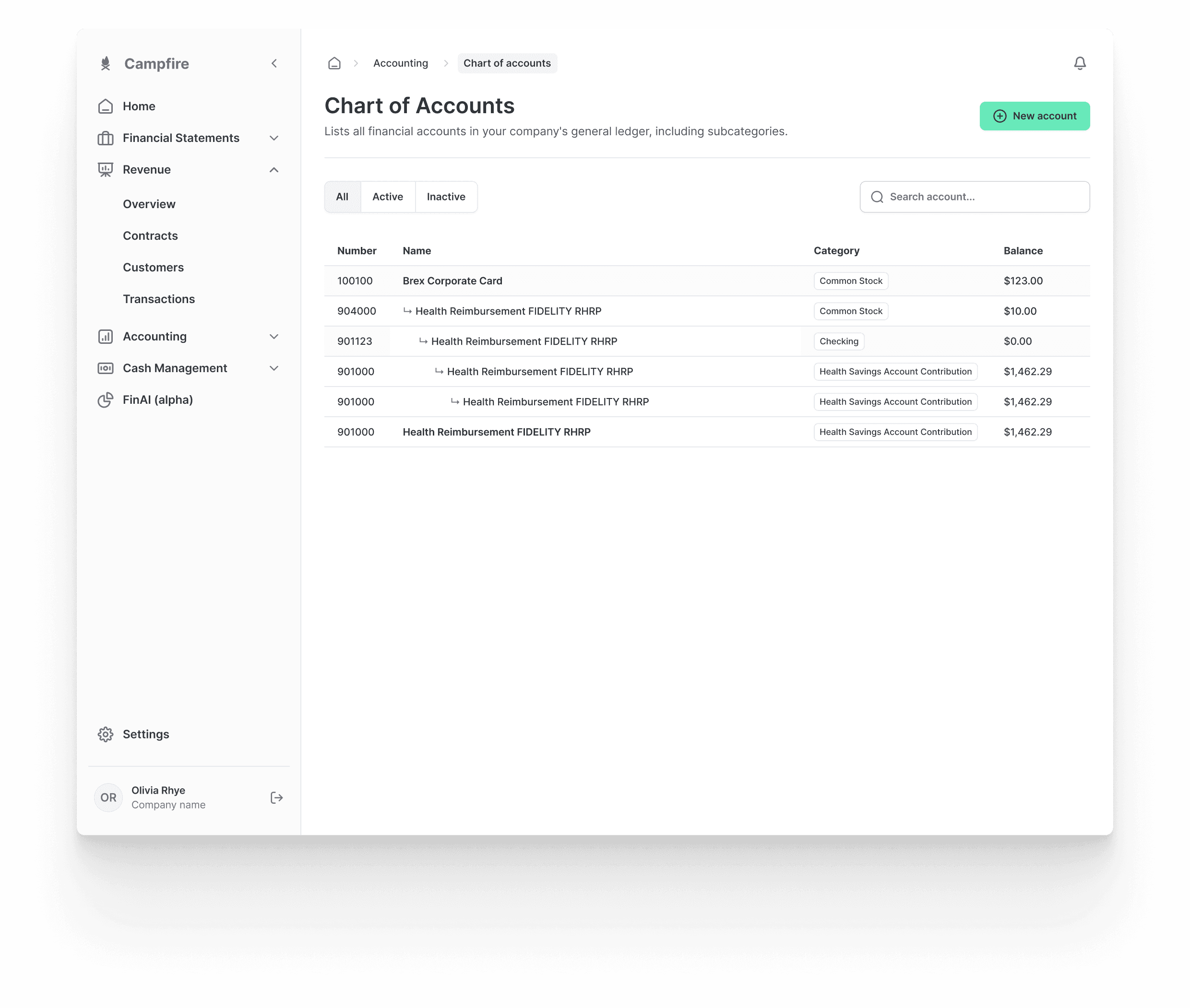
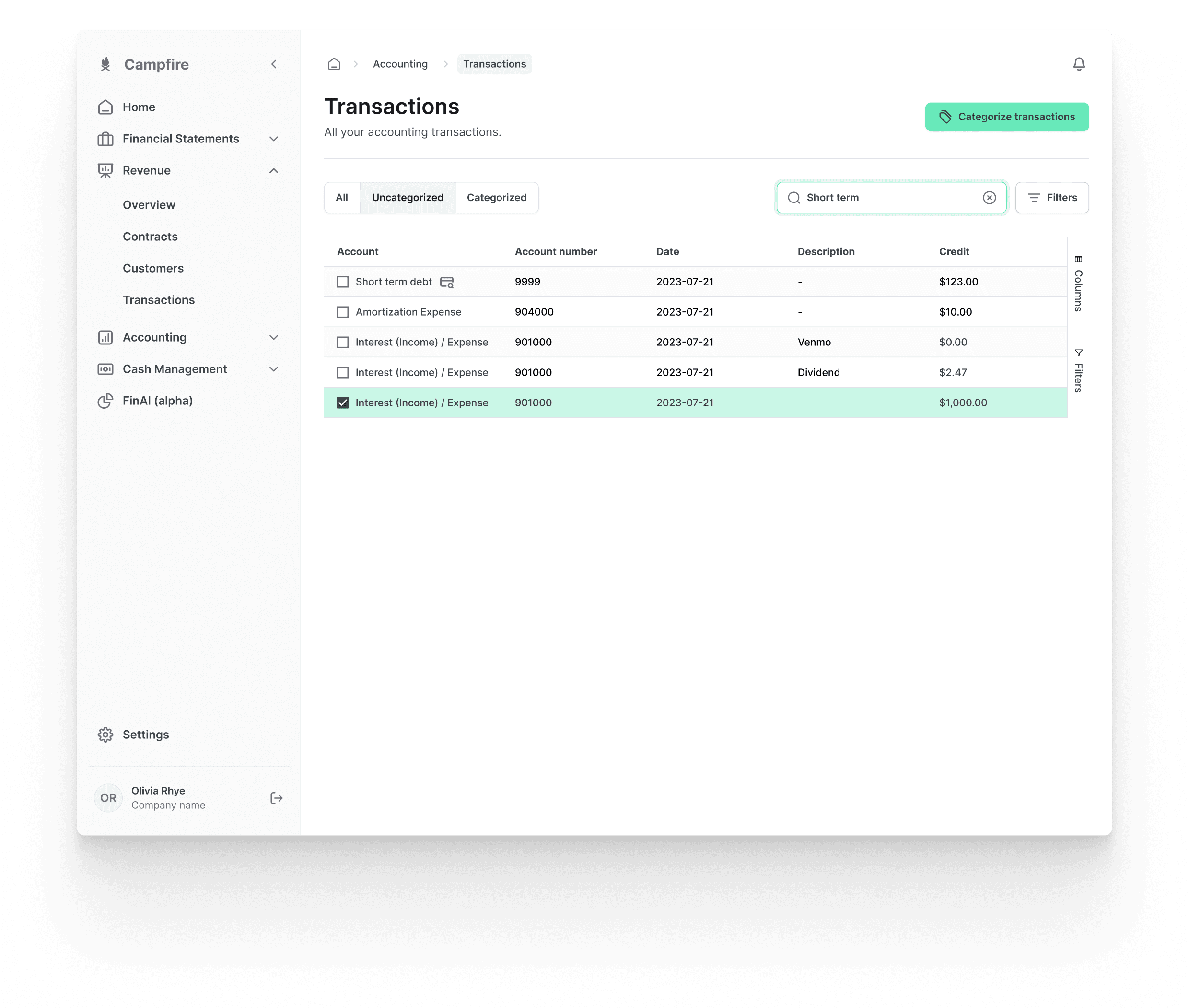
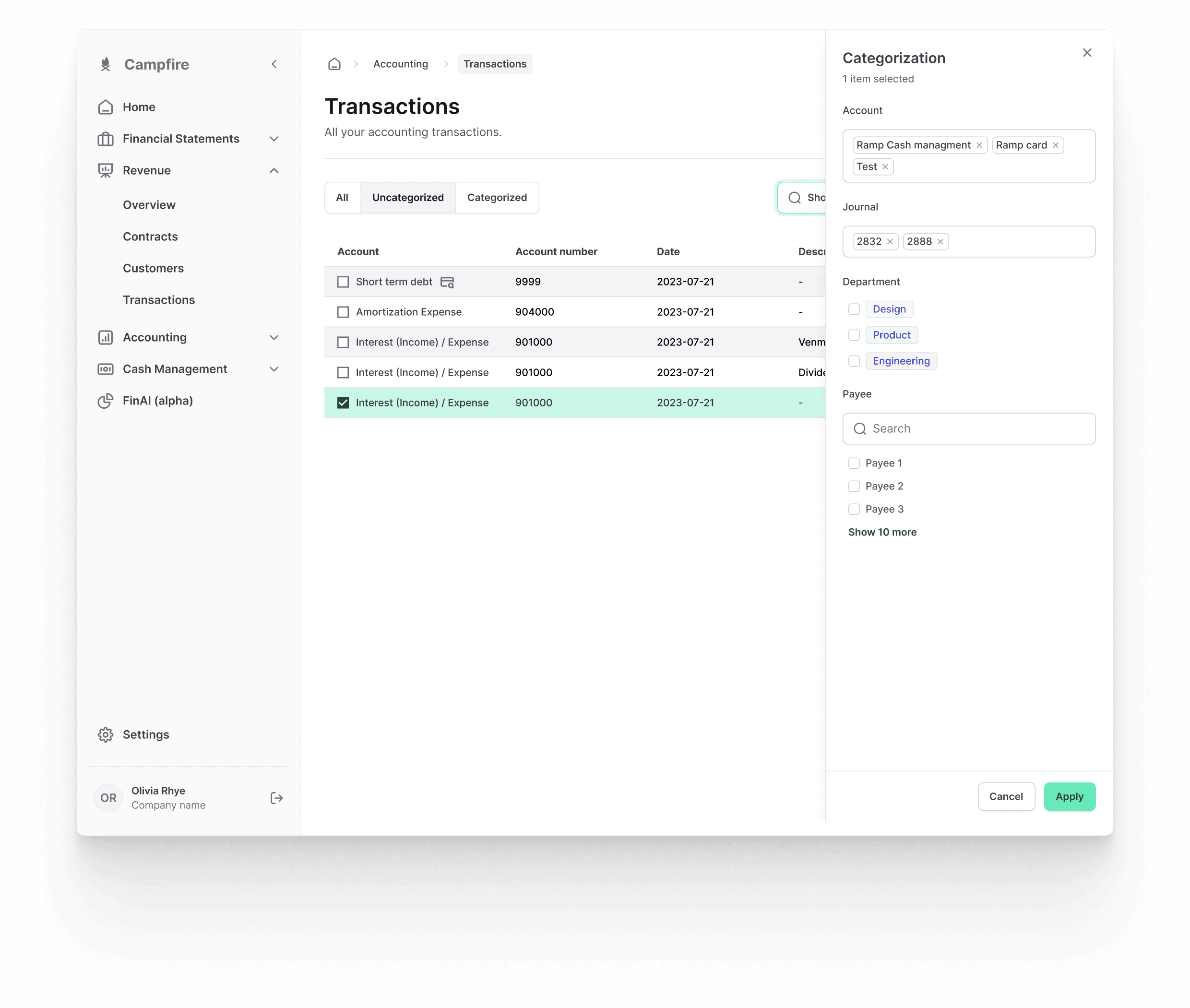
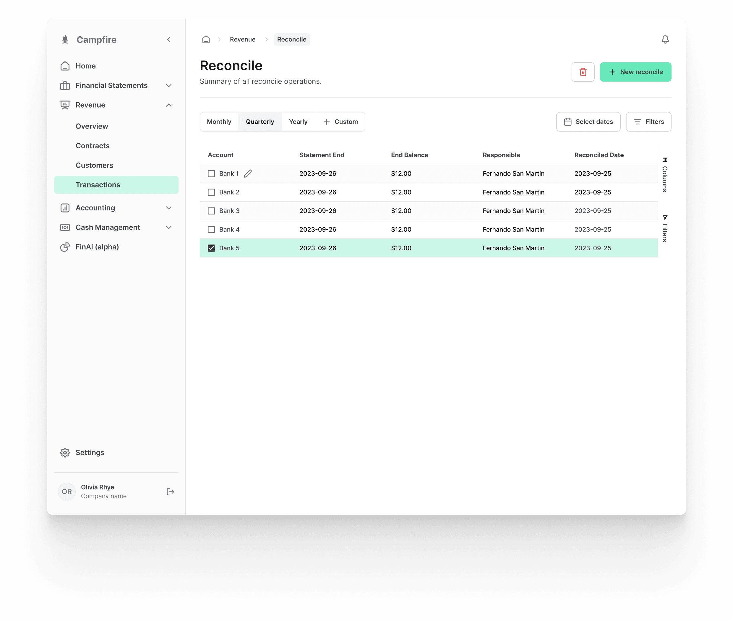
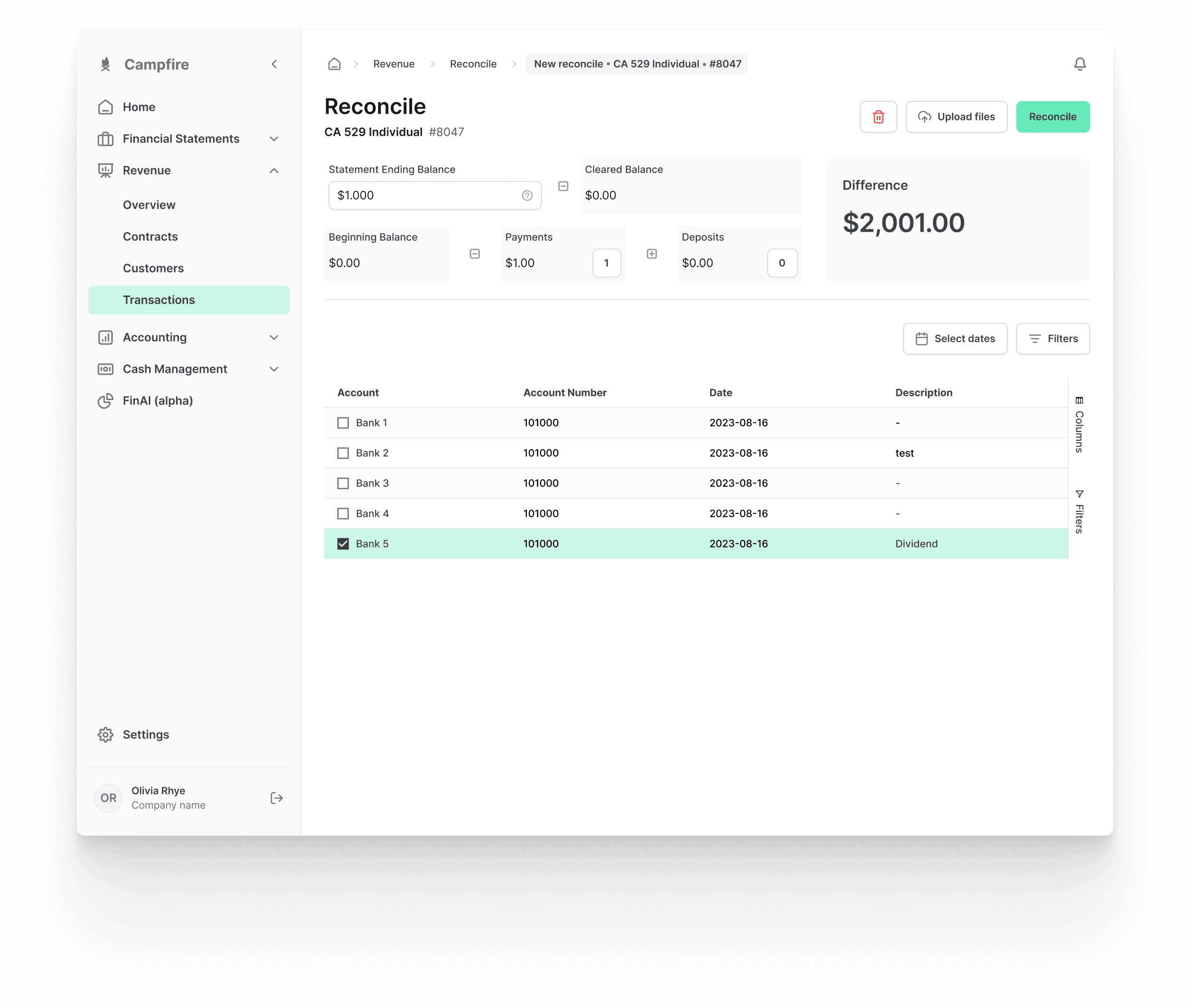
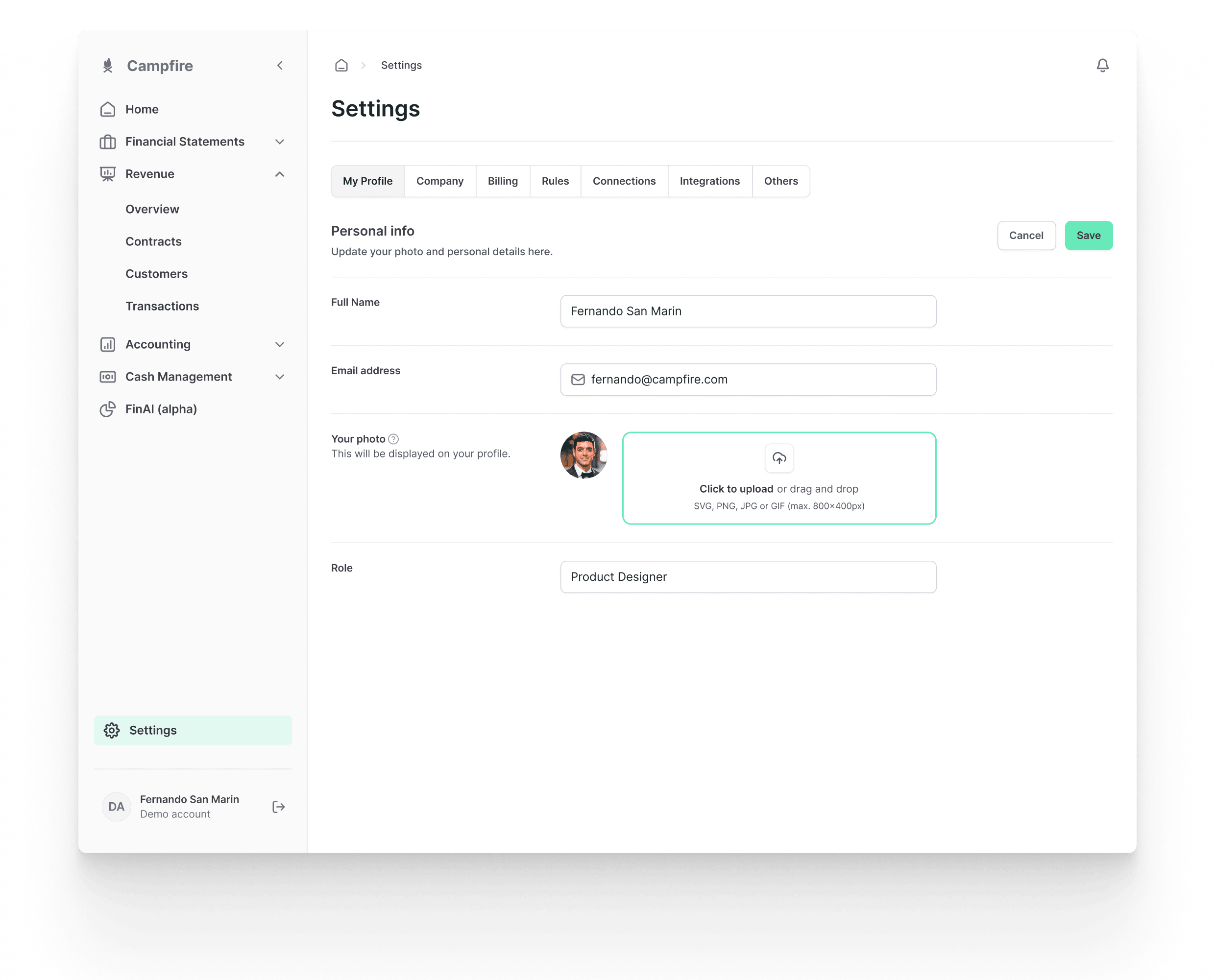
Campfire powers accounting and financial reporting by automating manual tasks and streamlining workflows.
The goal of the design collaboration with the Campfire team was to provide reference and structure to their user flows, while also working in close collaboration with front-end developers to implement design solutions created in Figma.
Design process
Starting a new collaboration involves diving into a design UI/UX audit to understand available resources and address practical design issues, ensuring smooth scalability and alignment with the team.
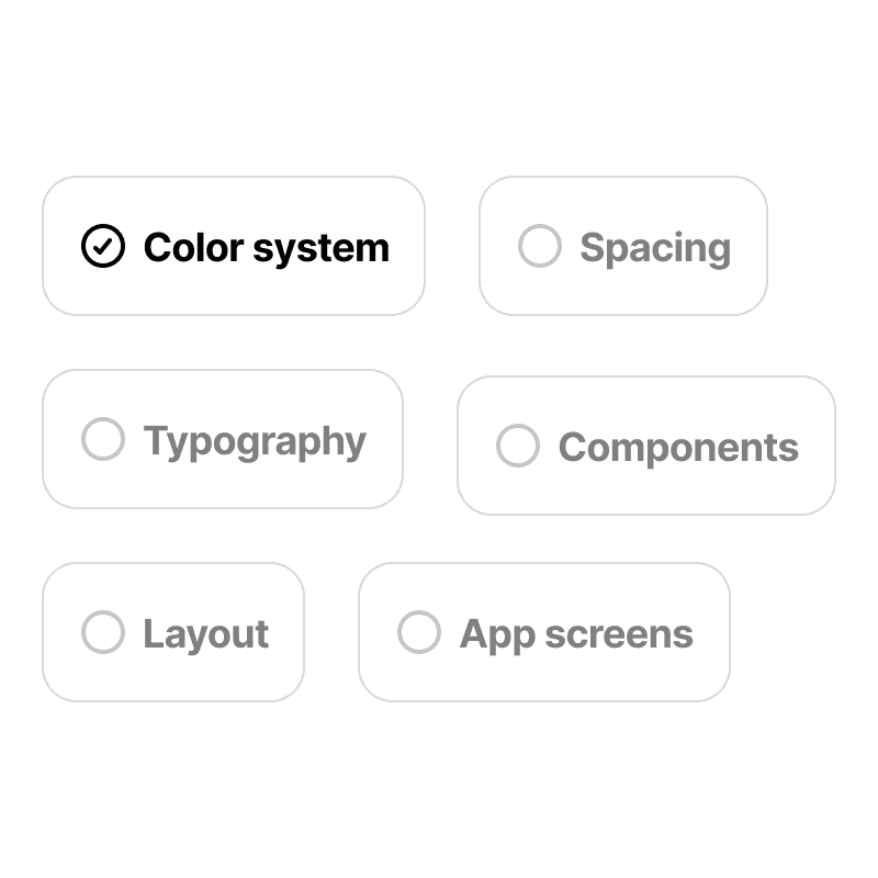
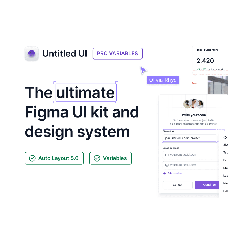
Startups aim to iterate quickly, which means setting up a basic design system or even adopting an existing one. Untitled UI is typically my default choice.
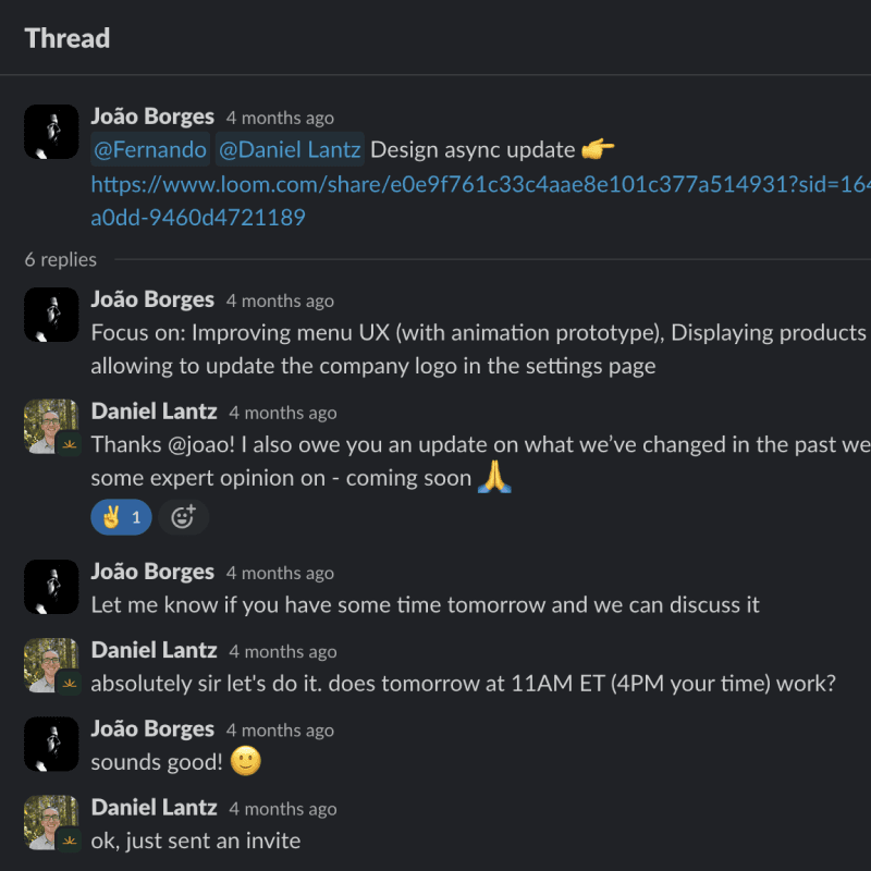
Close collaboration and communication are key to shaping the best possible product. Slack and Loom are my tools of choice for keeping everyone in the loop with regular updates.
Design process
Starting a new collaboration involves diving into a design UI/UX audit to understand available resources and address practical design issues, ensuring smooth scalability and alignment with the team.


Startups aim to iterate quickly, which means setting up a basic design system or even adopting an existing one. Untitled UI is typically my default choice.
Close collaboration and communication are key to shaping the best possible product. Slack and Loom are my tools of choice for keeping everyone in the loop with regular updates.

Design process
Starting a new collaboration involves diving into a design UI/UX audit to understand available resources and address practical design issues, ensuring smooth scalability and alignment with the team.


Startups aim to iterate quickly, which means setting up a basic design system or even adopting an existing one. Untitled UI is typically my default choice.
Close collaboration and communication are key to shaping the best possible product. Slack and Loom are my tools of choice for keeping everyone in the loop with regular updates.

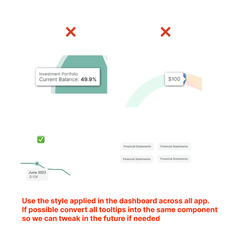
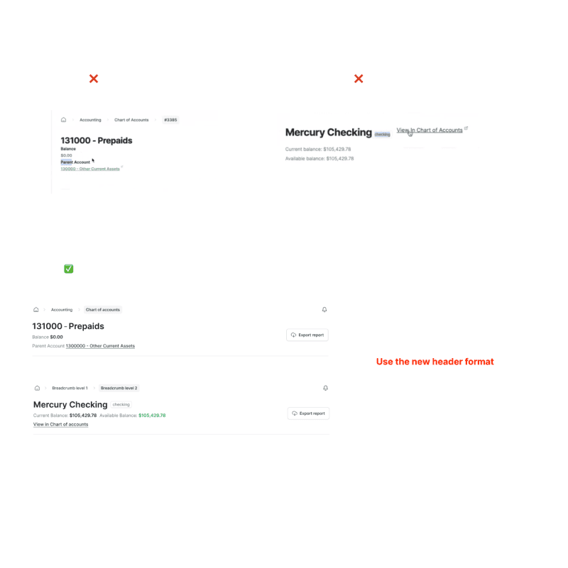
Sharing design feedback quickly is essential for any ambitious startup environment.
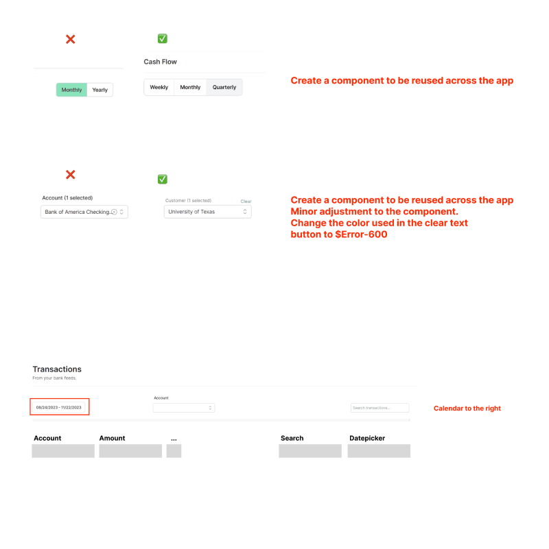
Instead of just providing fully fleshed-out mockups, the team was seeking a design collaborator capable of swiftly pinpointing problems and generating design solutions. Offering screenshots with brief documentation meant a rapid way to share thoughts and implementation ideas.
Furthermore, our focus on cultivating a serene and tranquil atmosphere led us to adopt light tones and diffused shadows in the UI. This deliberate choice aimed to evoke a sense of depth and calmness, enhancing the overall user experience. Through these strategies, we strived to not only meet but exceed user expectations, fostering a harmonious interaction between design and user needs.






Bring up the results while adapting to every team's workflow.
This collaboration aimed to provide a strong foundation by establishing a framework for the fast-paced development of the front-end team. There was a strong emphasis on collaborating with the founders and developers to build systems that could scale easily.
Furthermore, our focus on cultivating a serene and tranquil atmosphere led us to adopt light tones and diffused shadows in the UI. This deliberate choice aimed to evoke a sense of depth and calmness, enhancing the overall user experience. Through these strategies, we strived to not only meet but exceed user expectations, fostering a harmonious interaction between design and user needs.
